A New Look

Today, I’m unveiling the new artwork for my website, Etsy shop, and Facebook page. I’m excited!
Since I first opened a year ago, I knew I needed a more professional look – one I didn’t have the knowledge or talent to create. But I also knew that I would be a challenging client as I didn’t want to simply showcase one of my works. Nor did I want mere words in some special font spread across the page. I wanted my header and logo to impart a feel for my process. Does that sound like an artist or what?!
So, what could I possibly mean by “my process”? Not only am I referring to building a work with dozens of little pieces, I’m talking about the painting, the spraying, the adhering, the layering, and the unusual use of found objects. I’m talking about the part I most love about the art I create – the adventure of first constructing a background from various mediums and then slowly adding one embellishment after another as I discover just where my imagination is taking me. It’s never exactly as I imagined. And it’s always better than I envisioned.
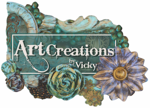
Jennifer Short with Quest Creative Design took up the challenge of demonstrating my process without words… with only two images. She used images that showcased the original use of everyday items. See the above logo? That light blue half circle you see on the upper left? That’s a paper milk bottle cap from the 1950s. You’ll also find hidden in there a plaster chandelier trim piece, a vintage earring, tree bark, beads that were once white, and flowers that were changed in color to coordinate with the design emerging in my head.
Now look at the header below. The light blue surface with tiny balls is actually a piece from a vintage black and red beaded purse. See the layering, the blending, the painting, the frosting of some items to give everything a cohesive look? That’s the process. And Jennifer captured it beautifully all while making it into an advertising piece.

Now I can finally order those new business cards (Jennifer designed those as well). I’ll be sharing those later.
Oh, and my new logo at the top of this post? It’s actually the shape of the items – without the white background. But technology gets in my way yet again. I don’t know how to work such an image into an article!
Vicky